Sector ETF opportunities: how AlphaDrift finds where fundamentals and price diverge
Most sector tools rank ETFs by recent returns. AlphaDrift does the opposite — it scores each sector's macro outlook independently of price, then measures where price has pulled back from strong fundamentals. The divergence is the signal.
- AlphaDrift scores all 25 GICS Industry Groups — not just the 11 broad sectors — giving you a more precise view of where opportunities sit.
- The Opportunity Score combines a price-independent macro outlook (6–12 month horizon) with a recent price dip signal. High macro + recent dip = the divergence pattern worth researching.
- Each sector is mapped to a targeted ETF — the most specific, liquid fund for that industry group — so you can act on sector-level signals with a single instrument.
Why smart investors think in sectors before stocks
Research on portfolio returns — notably the work of Brinson, Hood & Beebower and subsequent studies — suggests that asset allocation decisions may explain a larger share of portfolio variance than individual stock picks. Put simply: which sectors you're exposed to can matter more than which stocks you hold within them.
Yet most retail investors do it backwards. They pick stocks first, then discover their portfolio is accidentally concentrated in two or three sectors — or spread so thin that they're effectively holding an index at higher cost.
Sector-level thinking flips the process. Instead of asking "Is AAPL a good buy?", you ask "Is Software & Services in a strong position right now? What about Semiconductors? Banks?" Once you know which sectors have tailwinds, you can get exposure through a targeted sector ETF — or use the sector context to evaluate individual stock picks with more conviction.
What are GICS industry groups — and why 25 instead of 11?
The Global Industry Classification Standard (GICS) is the sector taxonomy created by MSCI and S&P Global. It organises publicly listed companies into four levels: 11 Sectors → 25 Industry Groups → 74 Industries → 163 Sub-Industries.
Most sector tools and ETF screeners work at the 11-sector level — Technology, Healthcare, Financials, and so on. AlphaDrift scores all 25 industry groups, one level deeper. This matters because groups within the same sector can behave very differently:
- Technology includes both Semiconductors (cyclical, capex-driven) and Software & Services (recurring revenue, lower capex). A "Technology is bullish" call misses the nuance.
- Financials includes Banks (rate-sensitive, credit risk), Insurance (underwriting cycle), and Diversified Financials (asset management, exchanges). Each responds differently to the same macro environment.
- Healthcare spans Pharma & Biotech (pipeline risk, patent cliffs) and Healthcare Equipment (procedure volumes, medtech innovation). One can be a Buy while the other is a Hold.
Scoring at the industry-group level gives you a more precise view — enough granularity to distinguish Semiconductors from Software, but not so many categories (the next level down is 74 industries) that scanning them daily becomes impractical. When AlphaDrift says "Semiconductors have a strong macro outlook but Banks face headwinds," that's a more actionable signal than "Technology is up, Financials are down."
The macro score: a 6–12 month fundamental outlook
The Macro Score (0–100) assesses each industry group's fundamental outlook over a 6–12 month horizon. It is completely price-independent — it never looks at recent ETF returns or stock prices. This is deliberate: if the macro score moved with price, it would just be momentum with extra steps.
The score blends three components, each generated by a different data source and AI model:
- Analyst Consensus (40% weight) — Buy/Hold/Sell rating distribution and forward EPS revision direction across each group's top constituents, sourced from Yahoo Finance analyst data.
- Structural Tailwinds (35% weight) — A Claude Sonnet AI model reads 8 universal economic indicators from the Federal Reserve Economic Data (FRED) database — including the fed funds rate, 10-year Treasury yield, consumer sentiment, and CPI inflation — plus group-specific supplements (e.g., semiconductor production index for Semiconductors, total vehicle sales for Automobiles).
- Expert Sentiment (25% weight) — Claude Haiku reads the last 14 days of news headlines from Finnhub for each group's top tickers, scoring the tone and direction of analyst upgrades, earnings guidance, and regulatory developments.
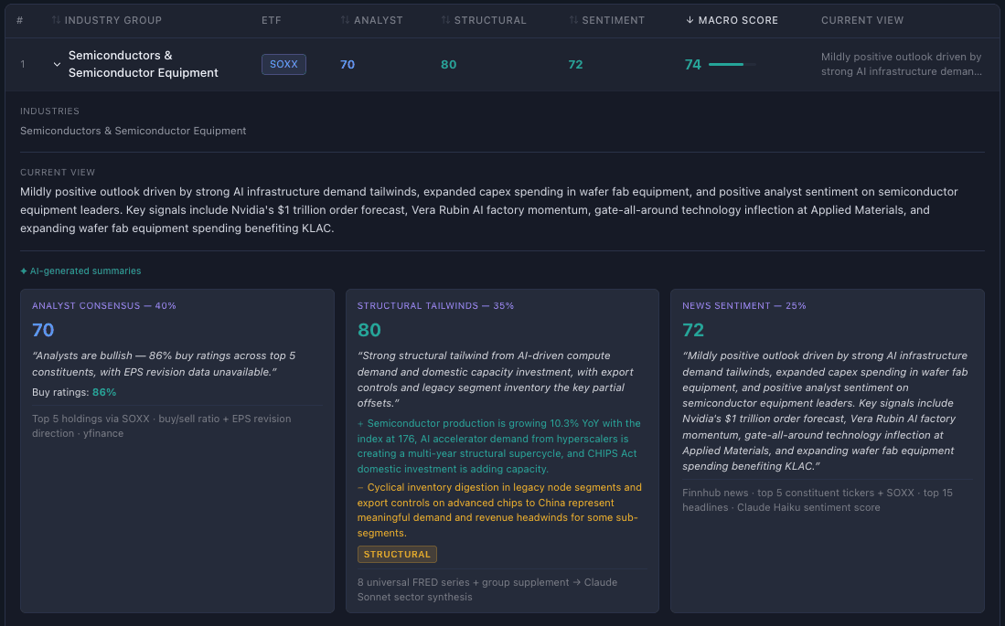
The result is a single score that captures whether structural, fundamental, and sentiment forces are working for or against each industry group — without being influenced by whether the ETF has recently risen or fallen. See how the full AI pipeline works →
Score bands: 75–100 = Strong Tailwinds, 60–74 = Positive, 45–59 = Neutral, 30–44 = Headwinds, 0–29 = Strong Headwinds. A score of 50 is dead neutral. View the live scores on the Macro Outlook page.
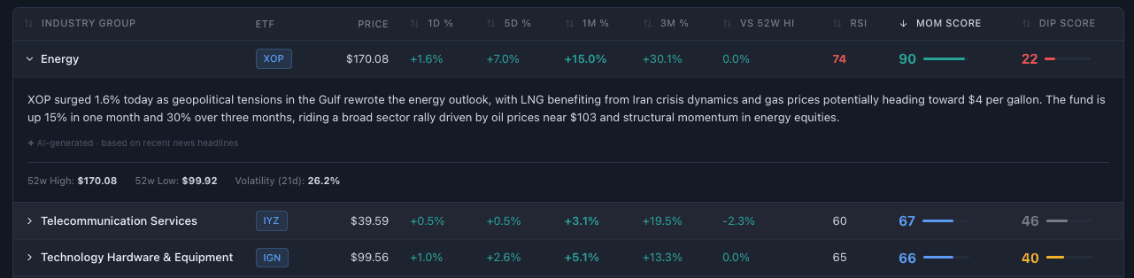
The dip signal: when price pulls back
The Dip Signal (0–100) measures how much a sector ETF has recently fallen. A higher score means a bigger recent dip. It uses three timeframes with different weights:
- 1-day return (20% weight) — Catches sudden drops from breaking news or panic selling.
- 5-day return (50% weight) — The heaviest weight. A week-long pullback is the sweet spot for a "dip" — long enough to be meaningful, short enough to distinguish from a sustained downtrend.
- 1-month return (30% weight) — Captures broader pullbacks, but deliberately excludes 3-month data. A stock that's been falling for three months may be repricing to new fundamentals — that's not a "dip," it's potentially a structural decline.
The signal is inverted: negative returns produce a high score. A dip score of 70+ means the sector has pulled back meaningfully in recent days. A dip score near 0 means it's been rising.
On its own, a high dip score doesn't mean much — some dips are deserved. The signal becomes interesting when paired with the macro score. See how momentum and dip scores work at the individual holding level →
The opportunity score: where fundamentals and price diverge
The Opportunity Score (0–100) is the core signal on AlphaDrift's Opportunity page. It combines the macro score and dip signal with equal weight:
- 50% Macro Score — Is the sector's fundamental outlook strong or weak?
- 50% Dip Signal — Has the price recently pulled back?
The score is highest when both components are high — a sector with strong fundamentals that has recently dipped in price. This is the divergence pattern: the market is pulling back on a sector whose fundamentals haven't changed.
Panic bonus
When a sector with a macro score of 60 or above drops 5% or more in a single day, the Opportunity Score gets a +15 point bonus. This rewards catching fear-driven selloffs in fundamentally strong sectors — the kind of sharp, emotional drop that often reverses once the panic subsides. The bonus is visible in the opportunity table as a lightning bolt indicator.
Signal bands
The Opportunity Score maps to five signal labels, each colour-coded in the dashboard:
- 75–100: Buy — Strong fundamentals + meaningful dip. The classic divergence pattern that may warrant research.
- 55–74: Watch — Good macro setup, but price hasn't dipped enough to create a clear entry signal. Worth monitoring.
- 40–54: Hold — Mixed signals. Neither the macro outlook nor the price action is compelling in either direction.
- 20–39: Avoid — Weak fundamentals, possibly with elevated price. A dip here might be a falling knife rather than an opportunity.
- 0–19: Exit — Weak macro outlook + rising or flat price. The sector may be overvalued relative to its fundamentals.
These labels are diagnostic, not prescriptive. A "Buy" label means the scoring system has flagged a divergence pattern — it doesn't mean "buy this ETF." Use it as a starting point for your own research, not as a trading instruction.
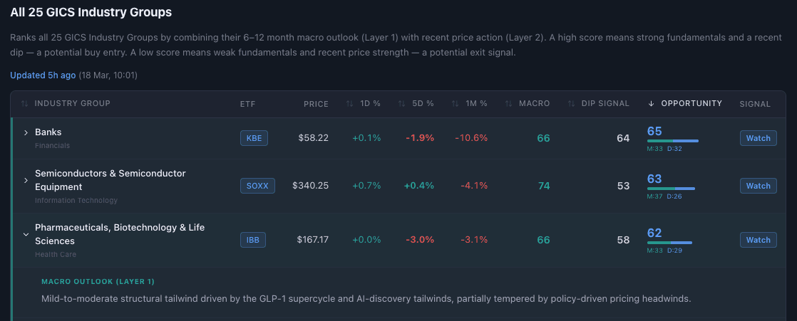
Reading the opportunity table
The Opportunity page ranks all 25 industry groups in a sortable table. Here's how to read it:
- Top 5 rows are highlighted in green — these are the sectors with the strongest opportunity signals. Click any row to expand an AI-generated rationale explaining the macro outlook, recent price action, and what the divergence might mean.
- Bottom 5 rows are highlighted in red — sectors where fundamentals are weak or price is elevated relative to outlook.
- Score breakdown bar — Each row shows a visual split between the macro contribution (teal) and the dip contribution (blue), so you can see which factor is driving the score.
- Sort by any column — Opportunity score, macro score, dip signal, or price changes (1-day, 5-day, 1-month) to find the view that matters most to your research.
Each sector row also shows the primary ETF — the most targeted, liquid ETF for that specific industry group. For Semiconductors that's SOXX, for Banks it's KBE, for Energy it's XOP. Broad sector ETFs like XLK or XLF are tracked for context but not used as the primary recommendation, because they span multiple industry groups and dilute the signal.
How to use sector signals in your investment process
Sector signals are most valuable as a top-down filter — a way to narrow your research focus before diving into individual stocks or ETFs. Here's how they fit into a practical workflow:
- Weekly sector check — Open the Opportunity page and scan the top 5 groups. Which sectors are flagged? Are they sectors you already have exposure to, or blind spots in your portfolio?
- Dip evaluation — When a sector you're interested in shows a high dip score, read the AI rationale and check the news. Is the dip driven by a one-off event (earnings miss, geopolitical headline) or something structural? Temporary catalysts on strong fundamentals are more interesting than structural deterioration.
- From sector to holdings — Once you've identified a sector worth researching, switch to the Holdings page to see how individual stocks within that sector are scoring on momentum, dip, and RSI.
- Sector context for stock picks — Already researching a specific stock? Check which industry group it belongs to and whether the sector has macro tailwinds or headwinds. A great company in a sector with strong headwinds may struggle despite its own merits.
What sector signals can't tell you: They don't predict timing — a sector with a Buy signal could dip further before recovering, or the macro environment could shift. They don't account for your existing exposure, risk tolerance, or tax situation. And they're one input among many — useful for narrowing focus, not for making isolated decisions.
Frequently asked questions
What ETFs does AlphaDrift track for sector opportunities?
AlphaDrift assigns one primary ETF to each of the 25 GICS Industry Groups — the most targeted, liquid ETF available. For example, SOXX for Semiconductors, KBE for Banks, and XOP for Energy. Broad sector ETFs like XLK or XLF are tracked for context but not used as the primary signal because they span multiple industry groups and dilute specificity.
What is the Opportunity Score and how is it calculated?
The Opportunity Score (0–100) combines two equally weighted signals: a Macro Score (6–12 month fundamental outlook, completely price-independent) and a Dip Signal (recent price pullback magnitude). A high score means strong fundamentals plus a recent price dip — the classic divergence pattern that may warrant research. A Panic Bonus of +15 points is added when a fundamentally strong sector drops 5% or more in a single day.
How often do sector opportunity scores update?
All three layers refresh daily after the US market close. Layer 1 (macro scores) pulls from FRED economic data, analyst consensus, and news sentiment. Layer 2 (momentum and dip signals) uses closing price data from Yahoo Finance. Layer 3 (opportunity scores) combines both and generates AI rationales for the top and bottom ranked sectors.
What is sector rotation and how does AlphaDrift approach it?
Sector rotation is the practice of shifting investment exposure between sectors as economic conditions change. Traditional approaches use business cycle models. AlphaDrift takes a data-driven approach: it scores each sector's macro outlook independently of price, then measures where price has diverged from fundamentals. The divergence itself is the signal.
What are GICS Industry Groups and why does AlphaDrift use 25 instead of 11 sectors?
GICS (Global Industry Classification Standard) is the sector taxonomy created by MSCI and S&P Global. Most tools work at the 11-sector level, but AlphaDrift scores all 25 industry groups — the next level down. This matters because groups within the same sector can behave very differently. Technology includes both Semiconductors and Software; Financials includes both Banks and Insurance. Twenty-five groups is enough granularity to spot these differences, without overwhelming you with 74 industries to scan every day.